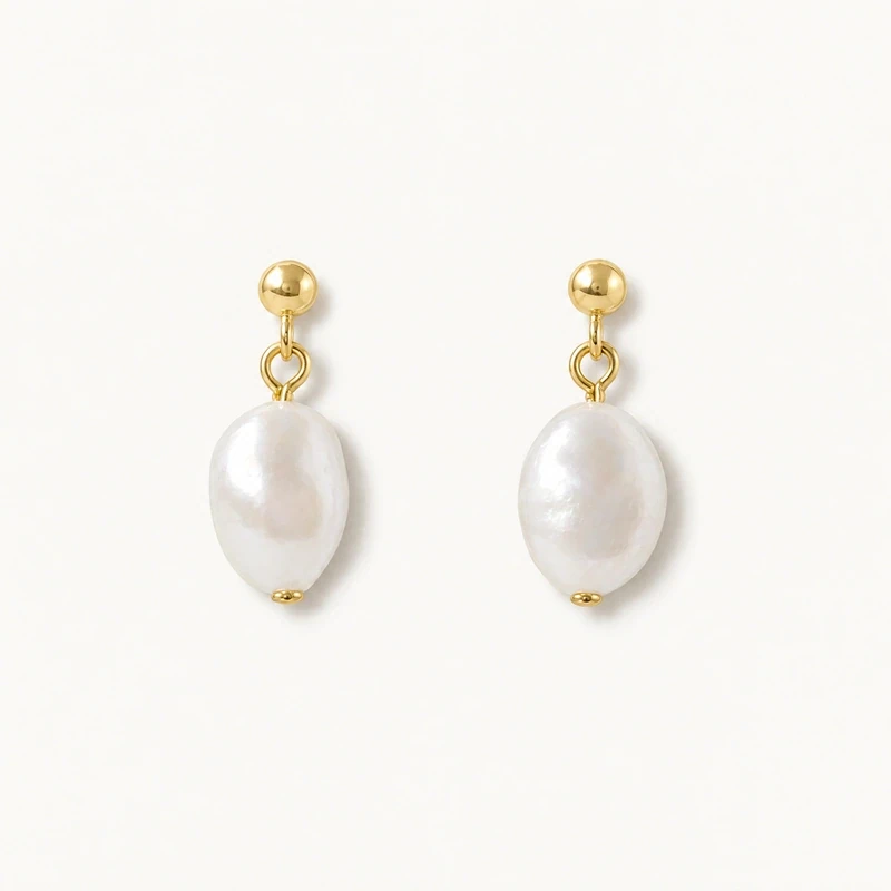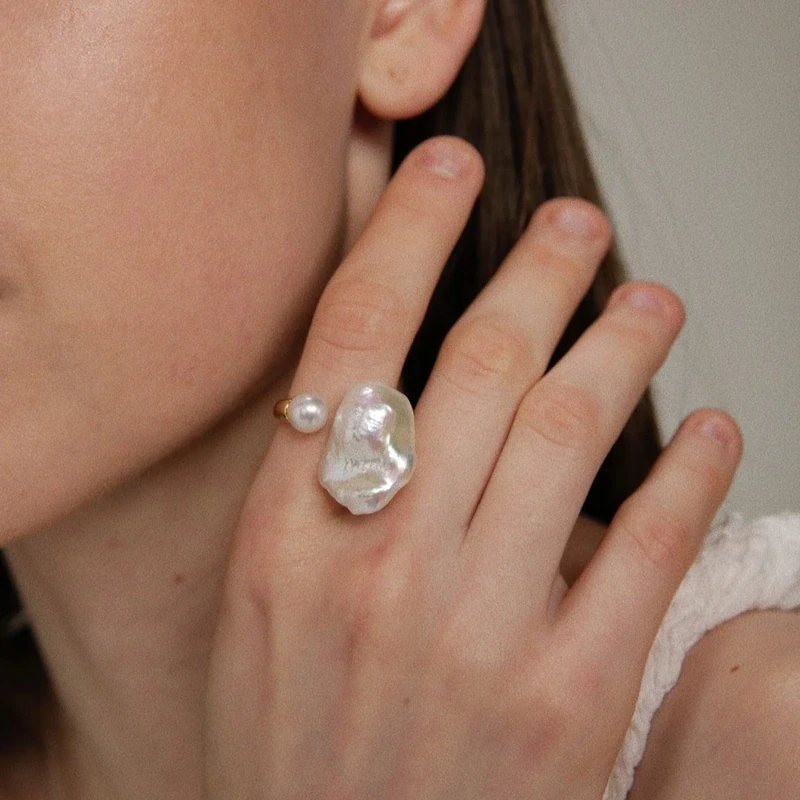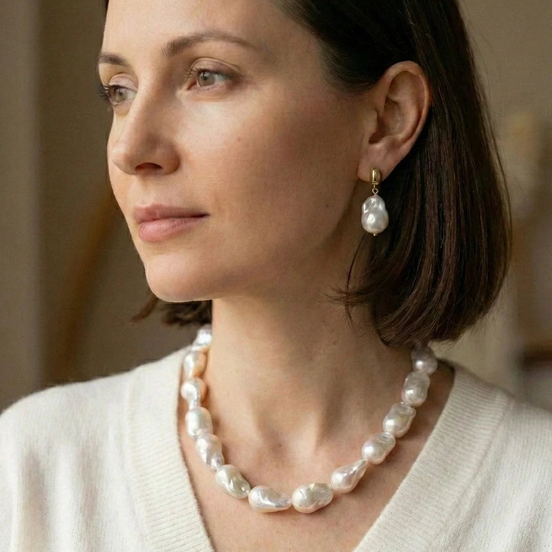
Silver and gold do not have to be assigned separate outfits. Worn together, the two tones can give pearl jewelry a considered, layered look: one metal provides contrast, while the other connects to a detail already in the outfit. The key is not to make every piece match, but to give each tone a reason to appear. Pearls help bring the combination together through their luminous, softly reflective surface, which can sit comfortably beside either metal.
Start by deciding what you want the jewelry to do. A mixed-metal look may be subtle, with one small accent against a dominant tone, or more balanced, with silver and gold appearing in repeated places. The choice of metal is also more than a color decision: sterling silver and 14k gold-filled components are different materials. Looking at both the visual effect and the listed metal option makes it easier to build a look that feels intentional without assuming anything about skin reactions or product performance.
Choose a lead tone before adding contrast
Rather than beginning with an equal split, choose which metal should lead. If most of your outfit's hardware is silver, silver can form the base of the jewelry combination, with a gold detail added as a deliberate contrast. If gold is more prominent, reverse the order. This gives the eye a clear starting point and keeps the combination from looking like several unrelated choices.
The lead tone does not need to appear in every piece. It can be the metal on the earrings or necklace, while the contrasting tone appears in a bracelet or ring. For instance, silver pearl earrings with a gold chain create a different balance from gold earrings and a silver bracelet. Consider the size and visibility of each piece, too: a larger component naturally draws more attention. Let the most noticeable item establish the emphasis, then use the second tone in a smaller or more restrained role.
Repeat the secondary metal for a connected look
A small amount of repetition can make mixed metals look planned. If you introduce gold in a necklace, echo it in earrings, a bracelet, or another visible detail. The repeated element need not be identical in shape or scale; a shared tone is enough to create a visual connection. Alternatively, if gold is the main tone and silver is the accent, repeat silver at least once rather than leaving it as a single isolated spot.
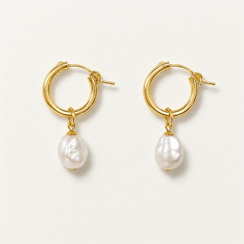
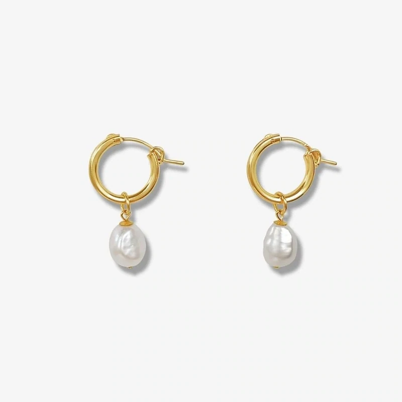
Repetition is a guide, not a strict matching rule. Two silver elements and one gold element can feel cohesive, as can a more even distribution, provided the pieces have a clear relationship. Pearl jewelry offers an easy way to establish that relationship: a pearl can recur across earrings and a pendant while the metals vary. The Ada Baroque Pearl Hoops pair freshwater baroque pearls with a choice of 14k gold-filled metal or sterling silver, depending on the selected Colour/Metal option. That makes the chosen hoop tone a practical starting point for the rest of the look.
Let clothing hardware guide, not dictate
Clothing details can offer a useful visual cue. Look at the visible fastenings on a jacket, belt, bag, or shoes, and notice whether silver or gold is already present. Repeating that tone in one piece of jewelry can make the outfit feel connected. If the hardware is mixed, it can support a mixed-metal combination rather than force a choice between the two.
Treat hardware as a styling reference, not a rule. A silver zipper does not require all-silver jewelry, and gold-toned buttons do not determine which metal will suit a person. You can use a contrasting tone to bring more definition, or choose pearls as a softer transition between distinct metal details. Also consider where the hardware sits: a buckle near the waist may be less visually connected to earrings than a fastening near the neckline. Use the details that are most visible together as your guide, then adjust by looking at the complete outfit.
Use pearls to soften the change between tones
Pearls can provide a common visual element when the metal tones differ. Their reflective surface sits between the brighter appearance of metal and the color of clothing, helping separate silver and gold without adding another strong color. This is especially useful when wearing one silver piece and one gold piece that would otherwise appear as isolated accents. A repeated pearl detail creates continuity even when the supporting metal changes.
Shape and scale also affect the overall impression. A single pearl pendant can keep a layered combination simple, while pearl hoops or a bracelet can make the pearl element more noticeable. The Jade I Baroque Pearl Pendant features one freshwater baroque pearl, approximately 10–12 mm, and offers a choice of 925 sterling silver or 14k gold-filled metal. Its chain is available in 40 cm or 45 cm, each with a 5 cm extender. Choose the option that supports the intended lead tone, then introduce the contrasting metal in another piece if you want a mixed look.
Separate appearance from material identity
“Silver” and “gold” can describe a color impression, but they do not by themselves identify a metal's composition. Sterling silver 925 is 92.5 percent silver. Gold-filled, gold-plated, vermeil, and solid gold are distinct categories, not interchangeable labels for a gold-colored surface. Vermeil has a sterling silver base. When comparing jewelry, use the listed material rather than judging composition by appearance alone.
For example, the products discussed here list either 14k gold-filled metal or 925 sterling silver, depending on the item and selected option. A gold-filled option should not be relabeled as solid gold, and a silver-colored appearance alone does not establish that a piece is sterling silver. The Federal Trade Commission's guidance on buying gold and silver jewelry explains common metal distinctions. This matters even in a styling article: knowing what you are choosing helps you compare pieces accurately while still treating tone as a separate design decision.
Coordinate finishes without demanding an exact match
Silver and gold pieces can have different visual finishes, and a slight contrast can add dimension. A smooth silver chain beside a more reflective gold-toned piece may look purposeful when the shapes or pearl details connect them. Instead of trying to make every surface identical, look at how the overall combination reads from a natural viewing distance. Ask whether one piece overwhelms the others, or whether the differences help define each item.
When you want a quieter combination, keep the shapes relatively simple and avoid introducing several unrelated focal points at once. For a more layered effect, vary the forms while repeating a metal tone or pearl detail. The Riley Keshi Pearl Bracelet has 10 freshwater baroque Keshi pearls, approximately 6–8 mm, on a chain offered in 14k gold-filled or 925 sterling silver. Its approximately 20 cm length adjusts shorter. Choose a chain tone that echoes a visible piece, or use it as the one contrasting metal accent.
Build a combination one piece at a time
A simple way to test a combination is to dress first, then add jewelry in stages. Put on the piece that best matches the outfit's strongest hardware or establishes the look you want. Add a pearl piece in the other tone, then pause before adding more. Check whether the contrast appears intentional and whether the pearl detail connects the pieces. If one tone feels isolated, repeat it with a small additional item or remove the lone accent.
For example, begin with silver pearl hoops and a gold pendant, then decide whether a bracelet should repeat gold or reinforce silver. There is no required ratio; visibility and the outfit's details matter more than counting pieces. You can browse the earrings collection for another way to build around an earring-led look. Keep your material choice tied to the product's actual listing, and make the final decision by viewing the complete outfit in ordinary light, not by relying on a universal matching formula.
Make the final choice practical and personal
Before settling on a combination, check the listed metal options on each item separately. Confirm whether you are choosing 14k gold-filled metal or 925 sterling silver, and do not assume that every part of a product uses the same material unless its description says so. This is particularly useful when combining items from different designs. A visually coordinated set can still contain different metal identities, and the material listing is the right place to verify what each piece is made from.
Then use a short styling check: identify the lead tone, repeat the second tone if it looks isolated, and see whether pearls link the pieces. Let clothing hardware inform the decision without treating it as a command, and choose finishes based on the overall effect rather than an assumed skin-tone rule. The result can be intentionally mixed without being complicated. Start with one pearl piece in the tone you wear most, add a contrasting piece, and keep or remove that accent according to how the full outfit reads.