Pearl jewelry can be organized in ways that make meaningful differences easier to understand. A shape-led assortment gives shoppers a practical starting point: rice, button, coin, and drop profiles each describe a different visual form, while the finished piece determines how that form reads when worn. Clear groupings help visitors compare without suggesting that shape alone establishes pearl type, origin, quality, or value.
For retailers, good merchandising is a matter of precise language and considerate presentation, not a promise of a particular sales result. Separate what a pearl is called from how a piece is constructed, and keep material, measurement, and variation details close to the product. Whether arranging a physical case or an online collection, use consistent labels and handling practices so customers can make informed comparisons.
Build the assortment around visible profiles
Start by identifying the shape terms that genuinely apply to the pieces in the assortment. Rice describes an elongated profile; button refers to a rounded, comparatively flattened form; coin identifies a broad, disc-like silhouette; and drop describes an overall hanging profile or earring form. These terms are useful for browsing, but they should not become claims about species or origin. Baroque means irregular in shape; it does not establish that a pearl is uncultured or belong to one particular pearl category.
Use a consistent taxonomy across signage, product titles, filters, and staff language. If a style includes more than one relevant descriptor, retain both rather than forcing a false choice: “baroque rice pearls,” for example, conveys the listed shape description more clearly than “natural rice pearls.” The GIA pearl description guidance distinguishes pearl categories and explains shape terminology. Keep that distinction visible in your wording, especially when customers may read “natural” as a statement about origin.
Make shape labels specific and restrained
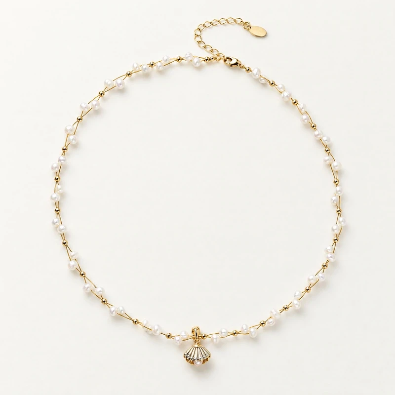
A product label should answer what the shopper can reasonably learn from the listing: the named pearl form, the jewelry type, and any listed material details. Avoid adding a shape, pearl category, origin, or treatment that is not stated for that product. “Freshwater baroque rice pearls” is an accurate description for the Rice Pearl Necklace, Ref. 070; “uncultured rice pearls” would not be supported.
Likewise, keep pearl terms separate from metal terms. The necklace description lists 14K gold-plated metal, freshwater baroque rice pearls, and gemstone details. That does not mean the metal is solid gold, gold-filled, or vermeil. When an item has selectable metal options, present each option exactly as listed and do not imply that one material applies to every version. A concise, accurate label is more useful than a string of embellishing adjectives.
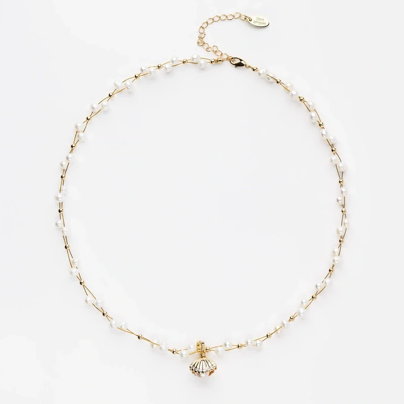
Use rice, button, and coin groupings to aid comparison
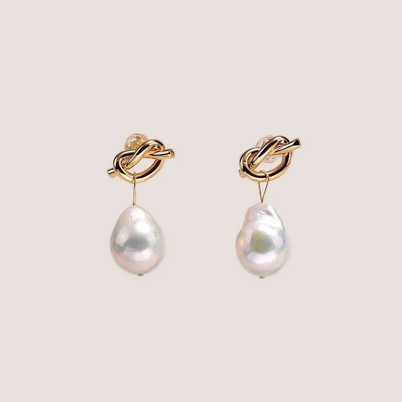
Organize products so shoppers can compare similar profiles before moving between categories. A rice grouping may include necklaces or other listed pieces whose pearls have an elongated rice description. A button grouping can help customers find flatter rounded forms, such as the freshwater baroque button pearls in the 14K Gold-Plated Pearl Earrings 074. Coin styles merit their own filter or subsection when the product descriptions identify that shape.
Shape should be a navigation aid, not a claim that every item in a group is otherwise alike. Keep jewelry type, materials, and any available measurements in the product detail, and allow filters to work together where the site supports them. A shopper comparing button earrings may also want to browse the earrings collection by material or silhouette. On a physical floor, use adjacent, clearly named groupings without implying that one profile is more valuable or better made than another.
Explain silhouette through measurements and context
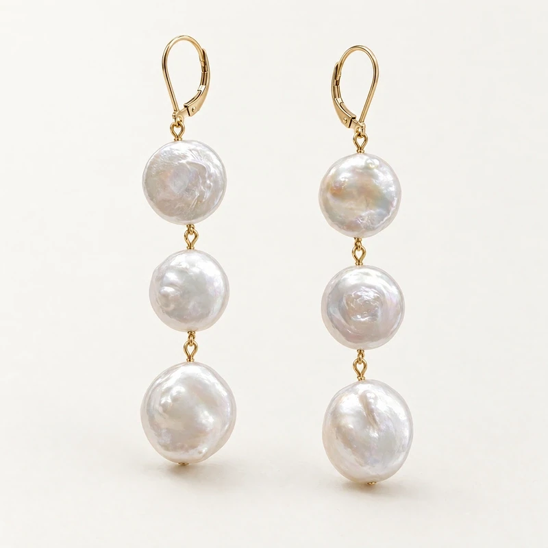
Silhouette describes the outline a piece creates, while measurements help make that outline more concrete. The Irene Freshwater Pearl Earrings offer a useful example because the listed coin-shaped style has an approximately 7–7.5 cm drop length, with pearls approximately 10–15 mm; the baroque-shaped style has an approximately 5–5.5 cm drop length, with pearls approximately 8–10 mm. The product description also says the larger coin-shaped pearls create a longer drop.
Keep those figures attached to the correct option. Do not transfer one version’s measurements to the other or imply that “coin” universally means a longer earring. The listed details describe these particular styles. In an online listing, place option names beside their corresponding measurements so customers can compare without guessing. On a tag or display card, use the same units and naming conventions as the product page. Measurements support practical decisions; they do not need to be turned into claims about fit or comfort.
Present variation without turning it into a defect claim
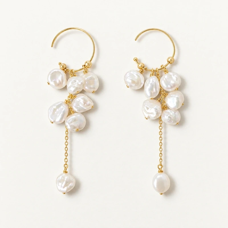
Natural differences in shape are especially relevant when describing baroque pearls. State what the listing actually says: the Irene earrings’ baroque pearls naturally vary in shape and may have imperfections, and each pair differs from the pictured earrings. That information sets an honest expectation without calling every variation a flaw or promising that any particular pair will look a certain way. Avoid language that suggests baroque is a quality grade or proof of natural, uncultured origin.
For other products, describe variation only when the product information supports it. Do not apply the Irene earring’s variation statement to the rice necklace or button earrings by assumption. In digital merchandising, make relevant variation notes easy to find near the product description and selected style. In a store, staff can explain that a shape term describes form, while specific appearance varies only where the item’s description says it does. Clear distinctions make comparison more useful than broad assurances.
Separate pieces and handle them conservatively
In a physical display, give pearl jewelry enough separation to reduce contact between pieces. Avoid crowded trays where metal components, clasps, or neighboring jewelry could rub against pearls. Use clean, stable supports and handle items gently when placing or retrieving them. Do not invent special storage properties or claim that a display material prevents damage; the practical aim is simply to limit unnecessary contact and make each silhouette easy to see.
Online merchandising also benefits from separation, though the work is organizational rather than physical. Keep distinct product entries and variant details clear, so a coin option is not confused with a baroque option or another item. For care guidance, pearls are soft and need conservative handling. The GIA pearl care guidance advises avoiding ultrasonic and steam cleaners, acids, chemicals, perfume, and excessive heat; wiping with a soft, clean cloth after wear is a practical basic step. For mixed-material pieces, take care with the entire item rather than treating the pearl in isolation.
Keep care advice close to the product
Care information is most useful when it is specific enough to guide a sensible routine without promising that a piece is immune to damage. Explain that a soft, clean cloth can be used after wearing. Occasional warm, soapy water may be appropriate for pearls, but strung jewelry must dry completely. Avoid recommending ultrasonic or steam cleaning, and do not encourage contact with perfume, acids, chemicals, or excessive heat. Where a piece combines pearls with metal or gemstones, conservative care for the complete piece is prudent.
For a retailer, a concise care note can live on a product page, a care page, or an accompanying printed card, with wording kept consistent across channels. Link shoppers to a relevant care resource, such as the jewelry care guide, rather than relying on unsupported claims such as waterproof, tarnish-free, or hypoallergenic. Staff can reinforce the same basic guidance at checkout or during browsing without promising a particular lifespan or outcome.
Audit the display before publishing or opening
Before a collection goes live or a case opens, review each item against a short checklist. Confirm that its shape wording matches the product description; pearl category and origin are not inferred from “baroque” or “natural”; and metal terms remain exact. Check that option-specific measurements stay with the right option, and that any variation statement belongs to the product it describes. Then compare labels across the site and store for consistency.
Finally, view the arrangement from a shopper’s perspective. Can someone move from rice to button to coin or drop profiles without confusing pearl shape with jewelry silhouette? Are product details and care advice easy to locate? Are pieces presented with enough separation for careful handling? Make those corrections before adding extra promotional language. A precise, shape-led display gives customers a clearer route to compare styles—and gives the retailer a dependable standard for maintaining accurate merchandising.