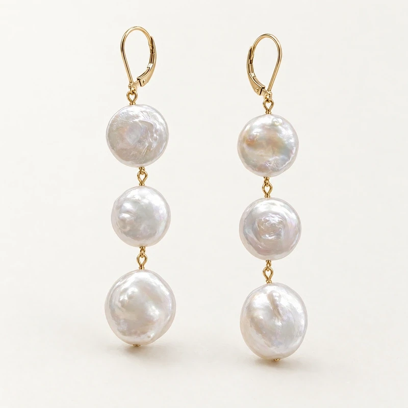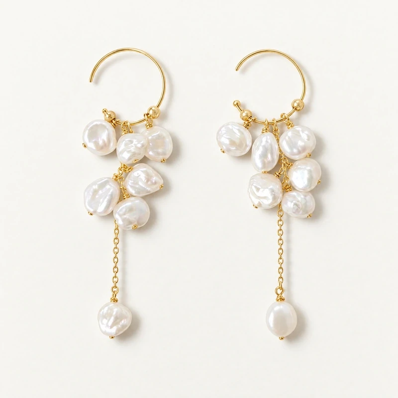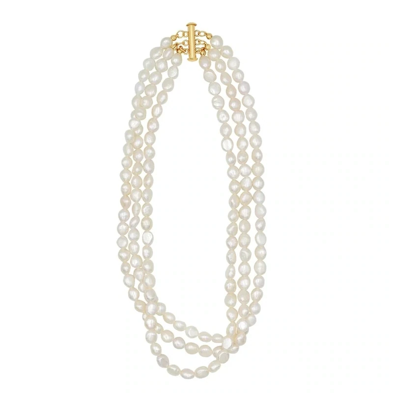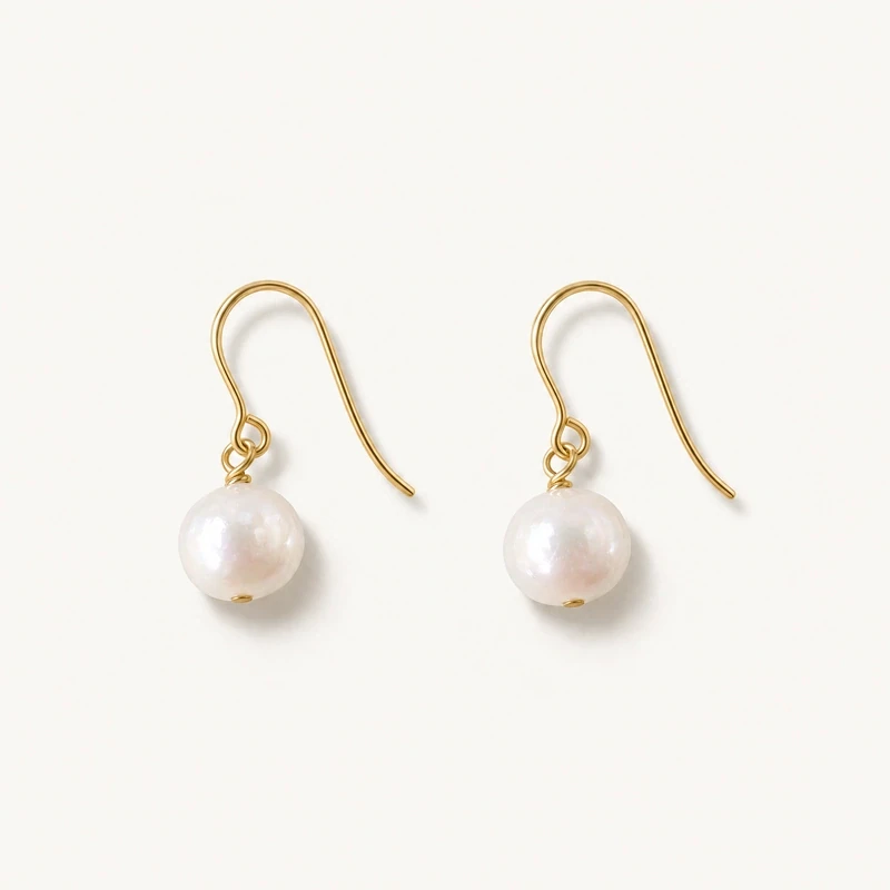
A seasonless pearl edit is not a forecast of what shoppers will want next spring or holiday season. It is a practical way to organize a selection around recurring wardrobe functions: a small piece for everyday wear, a more visible focal point, and an option that adds color or contrast. Pearls suit this approach because they appear in many forms, from restrained drops to irregular pendants and combinations with other materials.
For a retailer, the task is to make the selection understandable and useful without treating every style as interchangeable. Begin with the occasions and outfits your customers describe, then build a coherent range of silhouettes and visual effects. After the edit is in use, review what customers ask about, handle, try on, and purchase in your own store. Those observations can inform the next selection more reliably than a generic trend prediction.
Start with wardrobe functions, not seasons
Write down the practical roles the edit should cover before choosing individual designs. A discreet pair of earrings may serve customers looking for a repeat-wear piece; a pendant can provide a visible focal point; a colored stone and pearl combination can offer a stronger contrast. These are wardrobe functions, not assumptions about age, occasion, or a particular calendar. The aim is to help shoppers compare pieces by how they might fit into existing outfits.
Translate each function into a simple question for the assortment: Is there an option that feels visually quiet? Is there a piece with more presence? Can a customer find an accent that changes the palette without replacing an entire outfit? A range that answers those questions is easier to navigate than one arranged only by seasonal themes. Keep the roles distinct, while allowing some overlap; an everyday piece can still feel special, and a more expressive design need not be reserved for formal occasions.
Establish a core of recognizable silhouettes
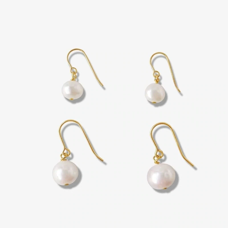
Core silhouettes give the edit continuity. Pearl drops and pendants are useful reference points because shoppers can quickly understand their form and compare scale. The Emma Freshwater Pearl Drops, for example, are offered in small and large sizes. The listed small length is 15–18 mm including the pearl, with a pearl approximately 6–7 mm; the large length is 20–25 mm, with a pearl approximately 8–9 mm. Those measurements provide concrete distinctions to explain at the point of sale.
Use silhouette to organize choices, rather than suggesting that one shape suits everyone. A small drop and a larger drop can meet different preferences for scale, while a single-pearl pendant offers a different way to wear the material. The Jade I Baroque Pearl Pendant uses one freshwater baroque pearl, approximately 10–12 mm. Its irregular shape means the individual appearance varies. That variation is part of the design’s character, but it should be described clearly so customers know they are not choosing a perfectly uniform form.
Use color accents with intention
Once the core silhouettes are clear, consider where a color accent adds a genuinely different option. The goal is not to assign a trend forecast to each shade, but to offer a useful contrast to the quieter pieces. Deep blue lapis lazuli paired with freshwater pearls, as in the Vintage Lapis Pearl Drop Earrings, brings a distinct palette and visual weight to a drop silhouette. The listed earrings are 3 cm long and sold as a pair.
Think about how an accent will sit beside the rest of the edit. If the core offers understated pearl forms, one or two combinations with color can help customers find a focal point without making the selection feel unrelated. Explain the materials and proportions plainly: this design lists lapis lazuli, freshwater pearl, and 18K gold vermeil. Vermeil has a sterling silver base; it is not interchangeable with solid gold or gold-filled metal. Clear material language supports comparison and avoids making the color accent seem like a different category of product.
Make scale and variation easy to compare
Retail presentation should help shoppers understand size before they commit to a style. Use listed measurements consistently, including whether a length includes the pearl. For earrings, distinguish the overall drop from the pearl’s approximate diameter; for a pendant, explain the chain options and extender. The Jade I pendant is listed with a 5 cm extender and chain options of 40 cm plus extender or 45 cm plus extender, for 45 cm or 50 cm total. Such details make comparison more specific than labels like “short” or “long.”
Also prepare customers for natural variation in freshwater pearls without implying that every piece is identical. The Emma drops may have spots or blemishes and may not be perfectly round; the baroque pendant has an irregular pearl whose appearance varies. These are useful expectations to state before a customer selects a piece. A consistent display and measurement approach can help make the range easier to assess; for related planning, see the earrings collection as a category reference, and connect product details to the actual pieces available in your own assortment.
Keep material choices distinct and legible
When a product offers metal options, show them as separate choices rather than collapsing them into a broad label such as “gold.” The Emma drops and Jade I pendant each offer 14k gold-filled or 925 sterling silver. Sterling silver 925 means 92.5 percent silver. Gold-filled is a distinct material category from gold-plated and solid gold. For the Vintage Lapis earrings, the listed material is 18K gold vermeil, which has a sterling silver base. Customers benefit when these distinctions are visible in product information and staff explanations.
Consistency matters across signage, online listings, and conversation. Use the exact listed material terms and avoid extending them into claims about wear life, allergy response, or care performance that are not established. If a shopper asks how to choose, guide them through the stated construction and the look they prefer rather than making a promise about how a finish will behave. An edit can feel cohesive through shared pearl elements while still offering meaningful material differences. This also gives staff a straightforward way to compare options without implying that one metal choice is universally better.
Review customer response through store observations
A seasonless edit should be revisited, but its review need not depend on invented sales narratives or broad industry predictions. Keep a simple record of what happens in your own store: which pieces customers ask to see, which measurements prompt questions, what they compare, and whether color or silhouette becomes the deciding factor. Note repeated requests for a smaller scale, a more prominent drop, a different chain length, or clearer material information. These observations can reveal practical friction even when a shopper does not make a purchase.
Separate what you observed from what you infer. A few requests may suggest a question worth exploring, not prove a universal preference. Compare observations across a useful period and consider whether display placement or explanation affected what customers noticed. Then decide whether to adjust the balance of roles, clarify descriptions, or test a different accent. This is a review process based on your own customer interactions, not a claim about past performance or a guarantee of future demand. Keep the next action small and measurable, such as updating a size guide or changing how similar silhouettes are grouped.
Support the edit with useful care guidance
Care information is part of a responsible retail edit because it helps customers understand how to handle pearl jewelry. Pearls are relatively soft, and GIA advises avoiding ultrasonic and steam cleaners, acids, chemicals, perfume, and excessive heat. A gentle wipe with a soft, clean cloth after wearing is a practical routine. For mixed-material pieces, conservative care is appropriate; the lapis and pearl earrings, for instance, combine more than one material, so avoid assuming every cleaning method suits every component.
Refer customers to GIA’s pearl care and cleaning guidance for additional information, and keep your own staff language aligned with the materials actually listed for each piece. Before finalizing the edit, check that each role is represented, dimensions are easy to find, variations are explained, and material choices remain distinct. Then use customer questions and handling observations to plan one clear review point. That process keeps the selection seasonless in a useful sense: grounded in how people dress and shop, and adaptable through careful attention to your own store.