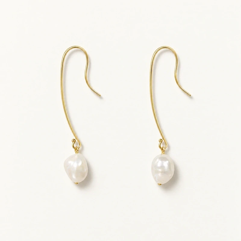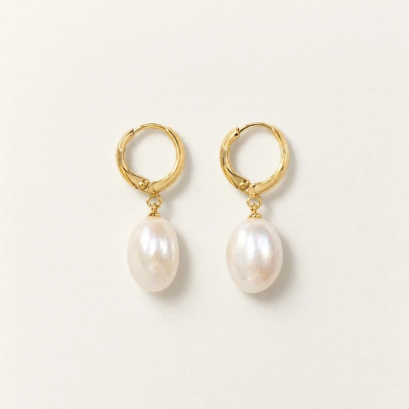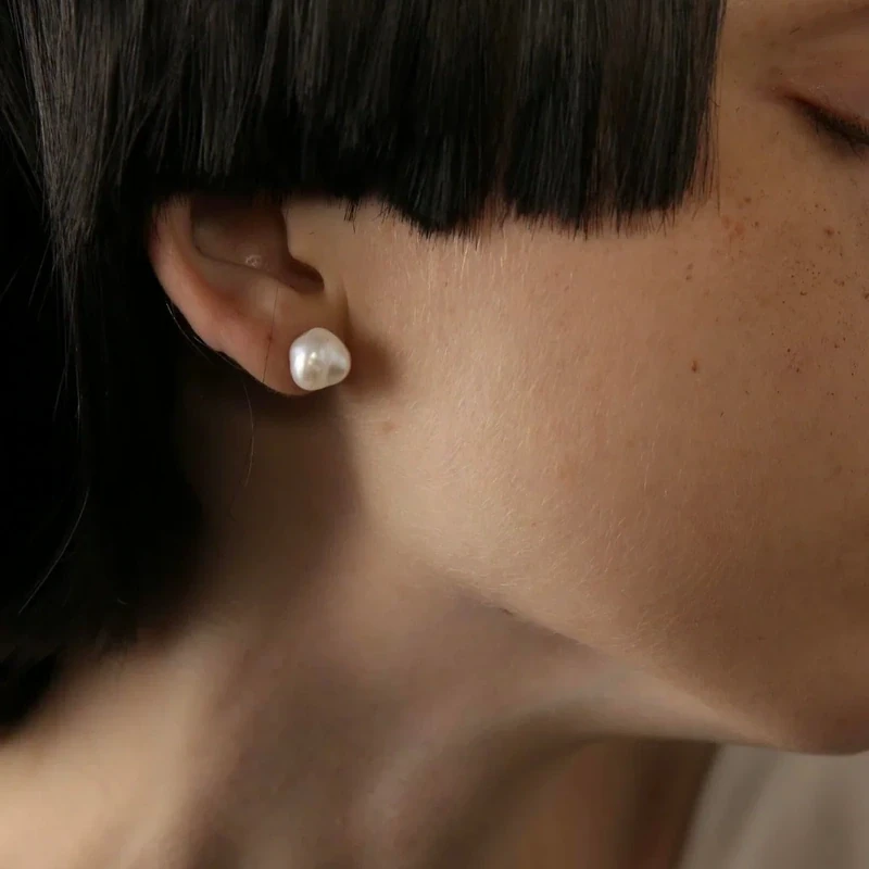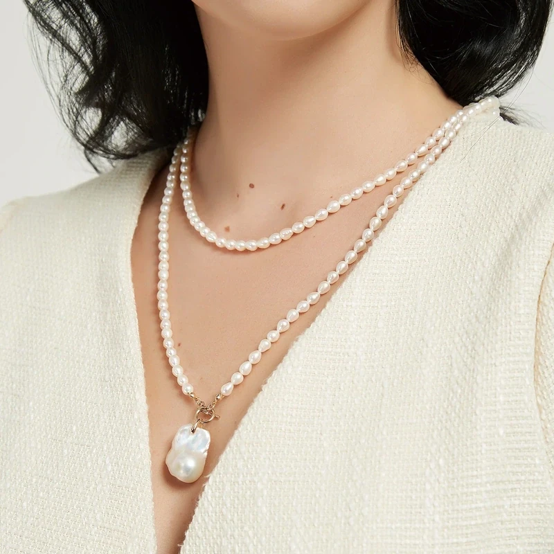
Pearl luster descriptions can be appealing without being especially precise. Words such as “multitone” suggest a changing visual effect, while a string of letter grades can look like a measurement. Neither tells you everything about how a necklace will appear when worn. A useful reading starts with what the description actually says about reflected light, then separates that information from shape, color, materials, and dimensions.
For a practical comparison, treat photographs as views under particular conditions rather than promises of an identical appearance everywhere. Look for the effect you enjoy, consider how it fits your wardrobe, and identify anything the listing leaves unanswered. The aim is not to invent a ranking system. It is to make a clear choice using supported details and a realistic understanding of what images and descriptive language can communicate.
1. Read Luster as an Appearance, Not a Complete Verdict
When reading a jewelry description, think of luster as the pearl’s appearance through reflected light. Ask what the wording helps you imagine: a noticeable highlight, changing tones, or a reflective effect across an irregular surface. These are useful visual cues, but they are not a complete assessment of the necklace. A description of luster does not establish the pearl’s origin, the composition of its fittings, or the construction of the piece.
Keep your comparison focused on the decision you are making. If you want a pendant that becomes the visual center of an outfit, consider whether its reflected-light effect appeals to you alongside its dimensions. If you prefer a quieter look, consider how the pictured pearl relates to the chain and neckline. Neither preference requires calling one pearl objectively better; the relevant question is which appearance suits your intended use.
2. Understand What Multitone Luster Actually Describes
“Multitone luster” is descriptive language for a visual effect involving more than one tone. In the product descriptions, both MONTE and JASMINE are described as reflecting differently or shifting in sunlight. Read that as a product-specific account of appearance, not a promise of fixed colors in every setting. It does not provide a standardized score or establish that every pearl in either design will look identical.
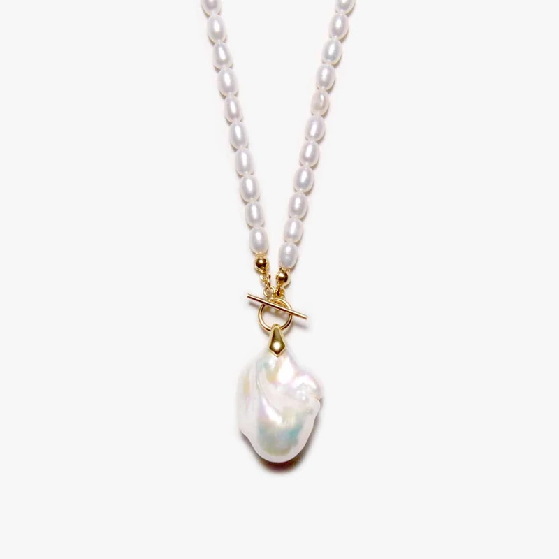
The MONTE Baroque Pearl Necklace features a randomly shaped freshwater baroque pearl with multitone luster. The JASMINE Baroque Pearl Necklace is hand-wrapped and features baroque pearls with multi-toned luster. Those descriptions give you a reason to consider changing reflections, but not to rank the two by luster alone. Compare their overall arrangements and listed measurements as well, rather than assuming similar wording means an identical visual result.
3. Give Photography a Clear but Limited Role
A photograph presents a pearl from a particular viewpoint under particular lighting. Use it to examine the visible arrangement of reflections, while remembering that you are seeing one presentation of the jewelry. A bright highlight should not become an invented luster score. Likewise, a less pronounced reflection in another photograph is not enough, on its own, to establish that the pictured pearl is inferior.
Where multiple views are available, compare the same feature across them instead of choosing only the most dramatic image. Notice whether you are responding to the pearl’s outline, a reflected tone, or the contrast with its background. If a listing offers only one view, leave room for uncertainty. You can ask for clarification about the described effect or an additional view, without assuming that such images or any specific photography service are available.
4. Separate Reflected Tones from Listed Pearl Colors
A listed color and a description of changing reflections answer different questions. Color wording tells you how the product is described; multitone luster draws attention to its appearance in light. Do not turn a reflected tone visible in a photograph into an unlisted material specification. Equally, do not assume that every color named in a necklace description refers to a luster effect.
The BETSY Baroque Pearl Necklace makes this distinction useful. Its chain is described as 4–6 mm candy-color pearls, with a 25–35 mm white pearl pendant. The product description does not specifically claim multitone luster for BETSY. Choose it for those stated colors, its hand-wrapped design, and its naturally varied pearl shapes if they suit your preferences; do not import the sunlight-shifting description from MONTE or JASMINE simply because all three necklaces feature baroque pearls.
5. Keep Baroque Shape Separate from Pearl Origin
Irregular shape is part of the appeal of baroque pearls, but “baroque” is a shape description rather than a pearl species or proof of uncultured origin. When viewing reflections, pay attention to the pearl’s outline as a separate feature. You may like an uneven silhouette and changing visual accents together, yet neither feature supplies information about how the pearl formed.
The GIA pearl description distinguishes natural pearls, which form without human intervention, from cultured pearls, which grow with human intervention and care. Cultured pearls are real pearls. MONTE is expressly described as freshwater; the listed JASMINE and BETSY descriptions do not identify their pearls as freshwater. Casual wording about “natural” shapes or variation should therefore not be read as confirmation of natural, uncultured origin. Keep that distinction intact when comparing appearance.
6. Do Not Turn Letter Grades into Universal Rankings
Letter grades in a product description can look more definitive than descriptive words, but they are not a universal grading scale or independent certification. The listed listings contain different letter-grade expressions. Without a shared, defined basis for comparison, those expressions do not establish a measurable luster difference between the necklaces. More letters or an added symbol should not become your sole reason for selecting one design.
Instead, give priority to details you can interpret directly: the stated pearl category where provided, dimensions, colors, necklace length, and metal wording. For luster specifically, use the actual description of the reflected-light effect. If a grade matters to your decision, ask what the seller means by it rather than assigning your own definition. Keep that question narrow: clarification of a listing’s terminology is different from assuming independent assessment, testing, or certification that has not been listed.
7. Compare the Whole Necklace Alongside Its Reflections
Luster is only one part of a wearable composition. MONTE lists a 25–35 mm pearl pendant, a 4–6 mm chain measurement, and a chain length of 40 inches (100 cm). Its selected metal options are 14K gold vermeil or sterling silver; these remain separate choices. Vermeil has a sterling silver base, and sterling silver 925 means 92.5 percent silver. Neither option should be collapsed into a general claim of solid gold.
JASMINE lists 25–35 mm pendant pearls, 4–6 mm chain pearls, and an approximately 100 cm length. BETSY is approximately 100 cm (40 inches) long. Both list 14K gold hooks, which should not be reinterpreted as solid gold without an express statement. When browsing the necklace collection, compare the complete arrangement against your planned neckline. Decide whether you prefer a single pendant emphasis or a pearl-led chain before letting one striking reflection determine the choice.
8. Make a Short, Evidence-Based Luster Checklist
Before choosing, write down three things: the reflected-light effect you prefer, the overall necklace arrangement you want, and any unresolved question. For example, a preference for a sunlight-shifting pendant points toward examining MONTE’s stated multitone effect. A preference for multi-toned baroque pearls in a hand-wrapped necklace makes JASMINE relevant. A candy-color pearl chain with a white pendant makes BETSY worth considering without requiring an unsupported multitone claim.
Then reread the listing once with the photograph out of view. Confirm which details are stated and which impressions came from the image alone. Return to the photograph to judge styling appeal, not to invent grades or origin information. If an unanswered question would change your choice, seek clarification before deciding. Your final selection should rest on a specific combination of appearance, dimensions, and materials you understand, rather than on the longest grade label or brightest photographed highlight.